SUCCESSIVE APPROXIMATION in SIT/THINK
/I know that the hippies in charge of the Art Fundraiser (Jul 13) would not care if this were the image I uploaded with my application, but I am made of more compulsive stuff. I whipped out Pixelmator Pro and created an elevation:
I added ramps. We are nothing if not inclusive at the burns.
Yes, if I were truly compulsive I would download and learn to use some 3-D sketch program so that I could just rotate that puppy for different views. I am not that compulsive.
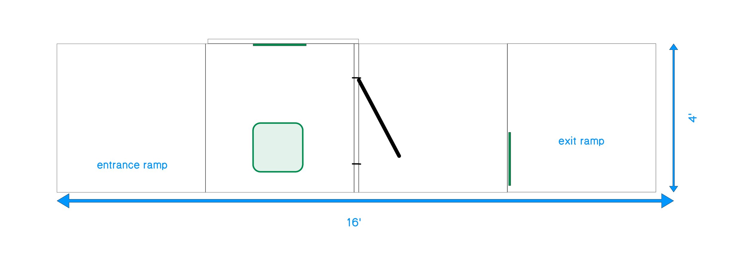
Here’s the plan view:
Finally, that theatre degree pays for itself.
After a few days of looking at the elevation, the 16’ length began to bother me. GESTALT will do that to you. It occurred to me that it wasn’t necessarily the length that was the problem—although a more compact footprint is always desirable at a burn—it was the fact that the “process” of the hippie exiting through the door into a bright white light would lose some of its wow factor if the hippie were to be seen simply going on his way straight ahead.
So I changed it.
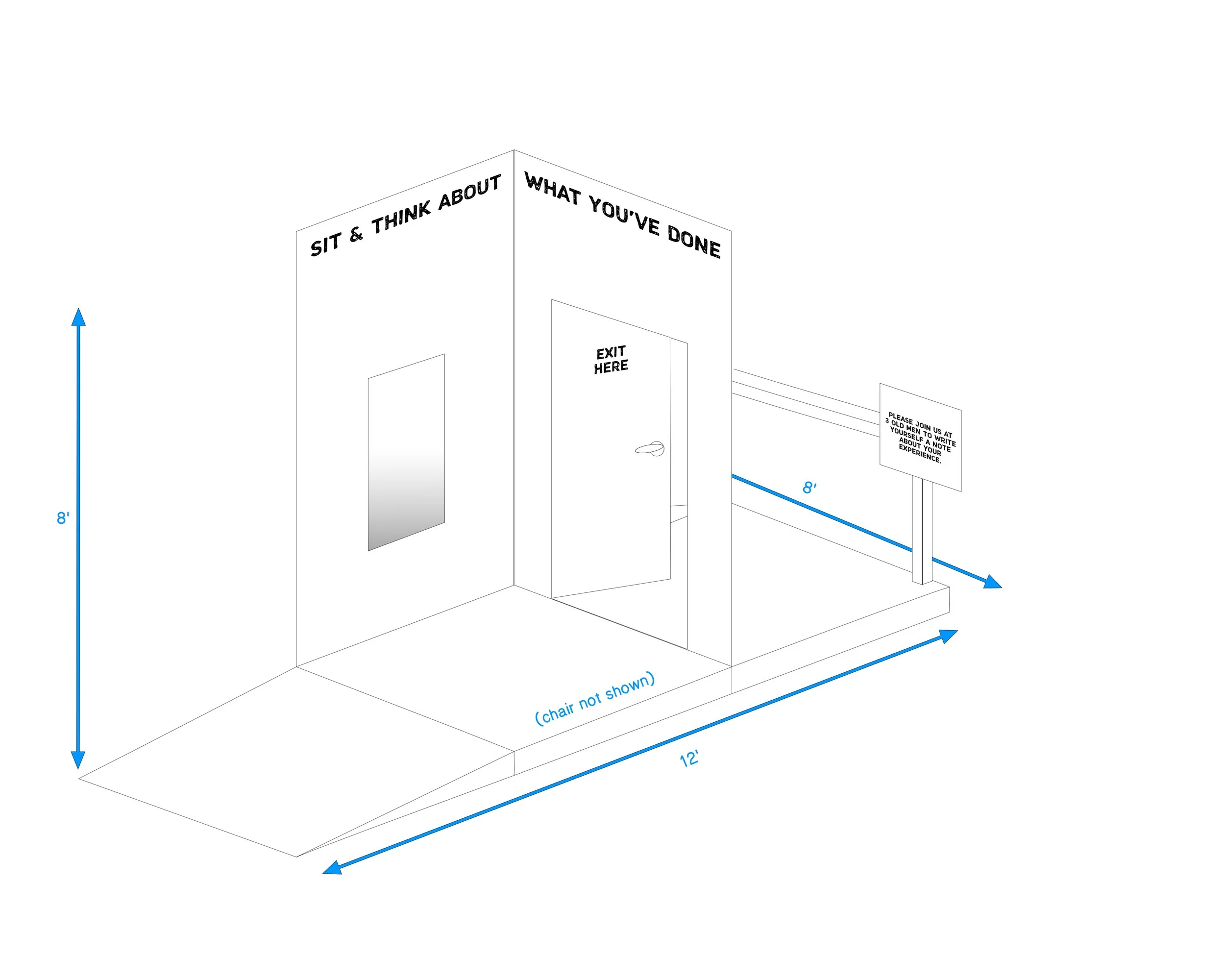
Now when the hippie exits, he will have to exit to the rear, i.e., vanish (temporarily) from the onlookers’ sight.
Here’s the elevation:
I will need to add a railing across the front of the exit platform and move the sign, but I think this SUCCESSIVE APPROXIMATION is where we’re headed.


